Growing Panes
|
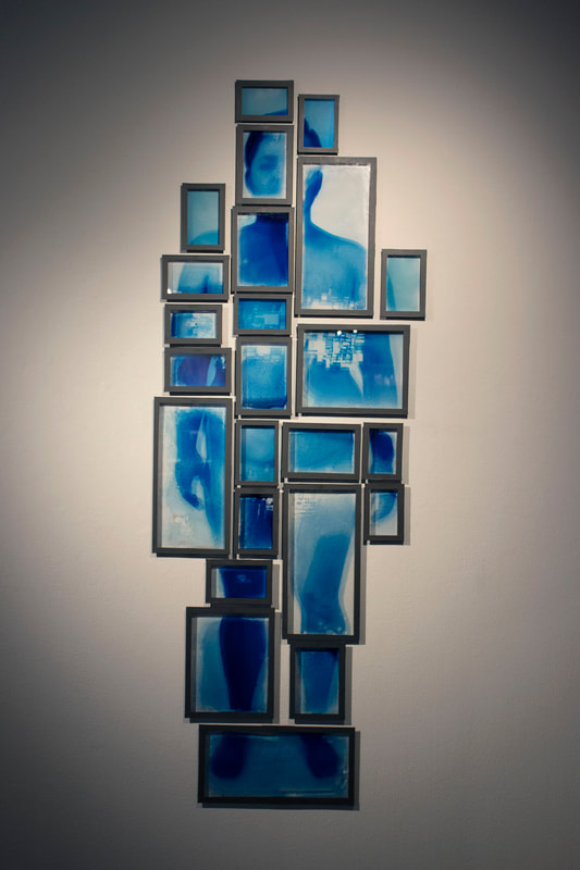
Growing Panes is a self-portrait collage that is made up of 24 individual images. Each image was created with a mixture of cyanotype and gelatin on thin glass panes. These images were then wrapped with matte washi tape and had small wooden blocks glued to the back for hanging them on the wall.
This series was created to explore and embrace the changes my body has made throughout its transition. My first big art series relating to my body was Body History, which really helped lay the foundation for all of my later work. Growing Panes, was created to mirror that project, but also explore the changes I have made in my life as a person and an artist. The frustrations and problems I worked through during this series will affect the rest of my life. I was very excited to try glass cyanotypes, but I was very anxious I would fail. In the end I am very happy I chose to stay on track, and I continue to surprise myself with the successes I have and with how I overcome my failures. While this series articulates the pain, I have gone through during my transition, it also demonstrates the pains I felt during this process. The flaws from tilted coatings, dog hairs that absolutely refused to stay away, and the edges that I am still figuring out. I am excited to continue this idea and technique, but I plan on changing a few things. I would like to try printing on acrylic instead, to hopefully minimize cracking and anxiety. I would also like to continue mastering this technique, so hopefully in the future the cyanotype will go all the way to the edge of the glass. |
|
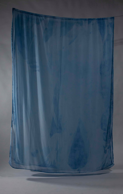
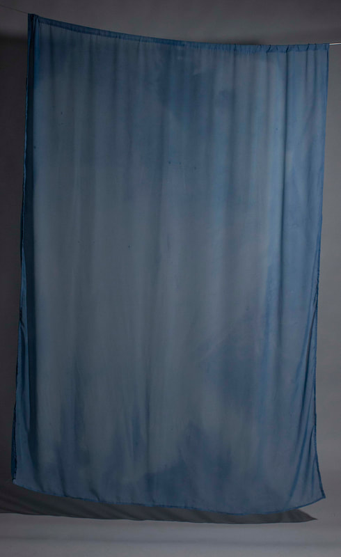
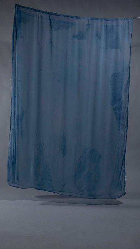
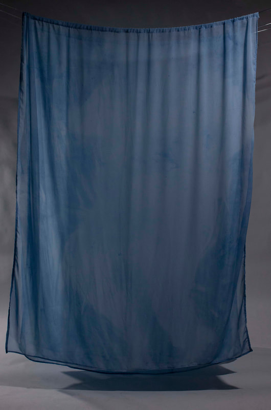
Dreamers
Dreamers, is made up of 4 cyanotyped, white voile curtains. The curtains are 76”x60”, approximately the size of the queen size bed my fiancé and I sleep on. The curtains are hung from the ceiling with about 3-4” between each curtain. All four curtains were exposed with our physical bodies as the negatives and the sun.
This series explores the intimate, yet mundane experience of sleeping together every night. Sleeping is one of the things that helps keep us sane, relaxes our bodies, and is a large amount of time that we get to spend with each other. Each curtain in this series displays one of the many ways we sleep at night. Some show the intimate moments we have where we are holding each other close, yet another shows how we sleep when we let our dogs in to sleep with us in the morning. The third type is how I sleep to deal with my back pain if it gets too bad, in this position I sleep upside down from Kajé and the change in the mattress helps to relieve some pain. Our sleeping experiences and positions are a connection between Kajé and I, and through the curtains the viewers are allowed to experience that intimacy with us.
This series explores the intimate, yet mundane experience of sleeping together every night. Sleeping is one of the things that helps keep us sane, relaxes our bodies, and is a large amount of time that we get to spend with each other. Each curtain in this series displays one of the many ways we sleep at night. Some show the intimate moments we have where we are holding each other close, yet another shows how we sleep when we let our dogs in to sleep with us in the morning. The third type is how I sleep to deal with my back pain if it gets too bad, in this position I sleep upside down from Kajé and the change in the mattress helps to relieve some pain. Our sleeping experiences and positions are a connection between Kajé and I, and through the curtains the viewers are allowed to experience that intimacy with us.
|
|
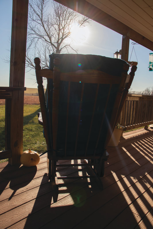
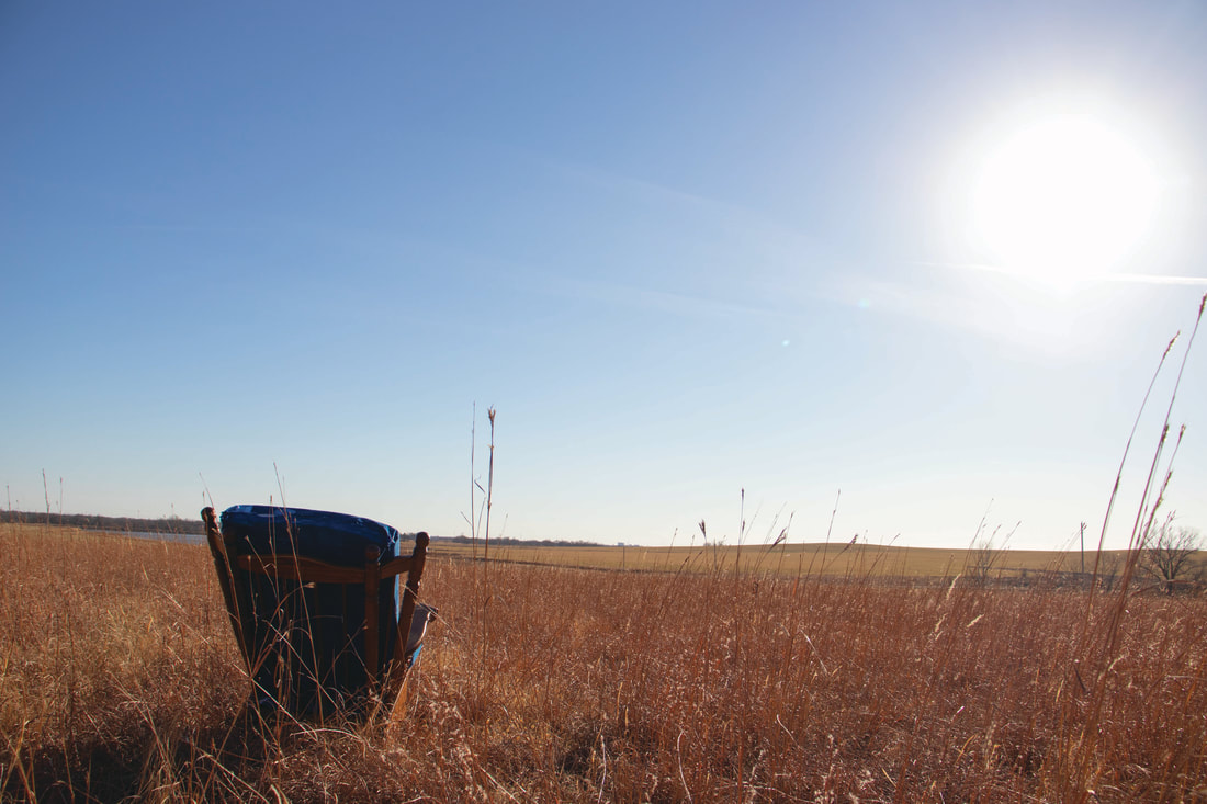
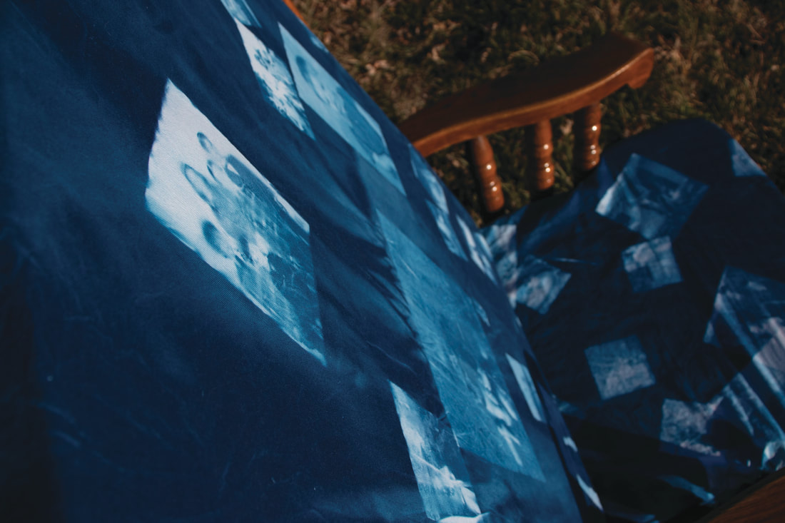
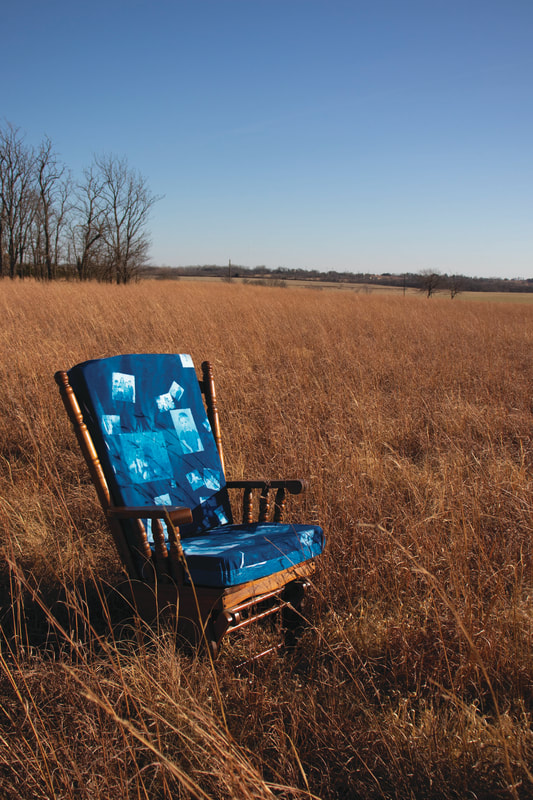
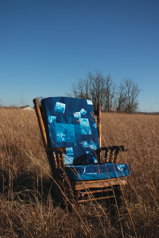
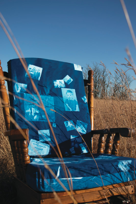
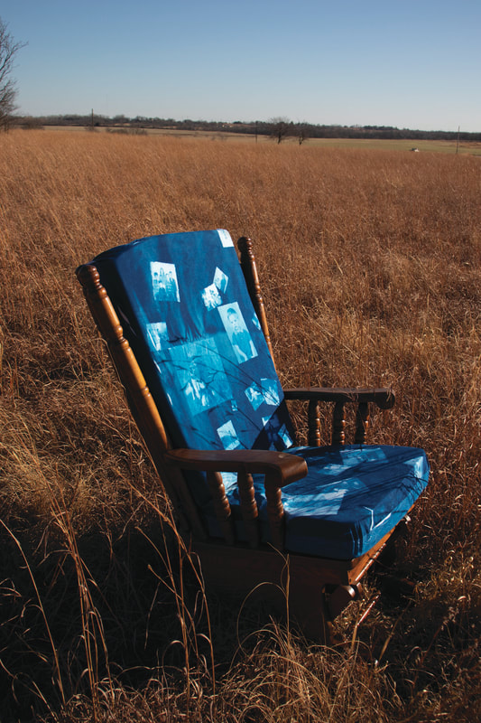
A Foundation To Rest On
A Foundation To Rest On, is a series inspired by my previous photo series, Remnants of Home, where I took my father's rocking chair to all of his favorite places while he was permanently living at the nursing home. In this series I decided to use images from my father's childhood to create a second set of cushions for my father's chair.
My meaning behind this idea is that my father's childhood experiences and connections formed the foundation of the rest of his life. My father was quite the social butterfly, and always wanted to be friends with everyone he met which meant he grew up to have a lot of really strong and personal connections. He was also a great storyteller, and was constantly taking about things he has done or seen, and he was always so captivating while he did it. The images I was placing on the cushion were some of his proudest memories and accomplishments from when he was young, which I see as a lot of his foundation. This cushion series allows the viewer to have a visual representation of how my father's childhood went on to support him even to his last day here.
My meaning behind this idea is that my father's childhood experiences and connections formed the foundation of the rest of his life. My father was quite the social butterfly, and always wanted to be friends with everyone he met which meant he grew up to have a lot of really strong and personal connections. He was also a great storyteller, and was constantly taking about things he has done or seen, and he was always so captivating while he did it. The images I was placing on the cushion were some of his proudest memories and accomplishments from when he was young, which I see as a lot of his foundation. This cushion series allows the viewer to have a visual representation of how my father's childhood went on to support him even to his last day here.
|
|
|
|
|
|
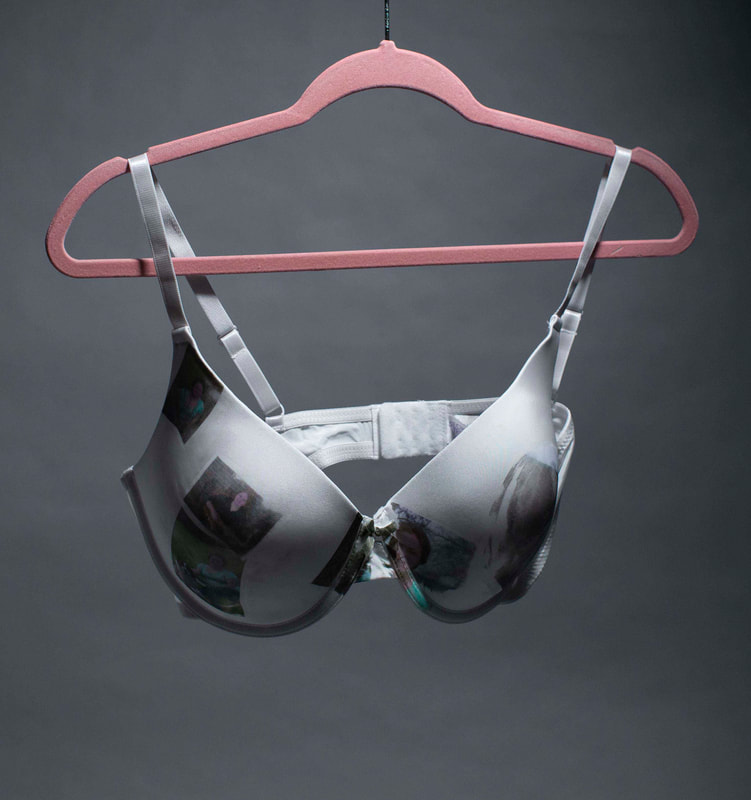
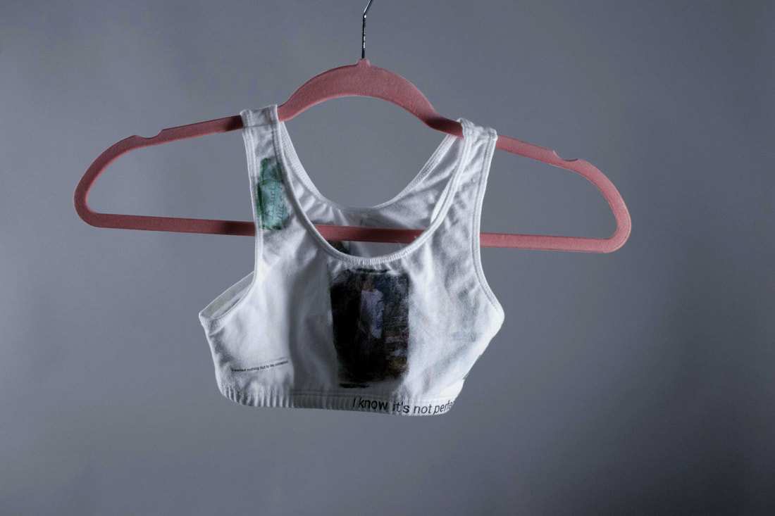
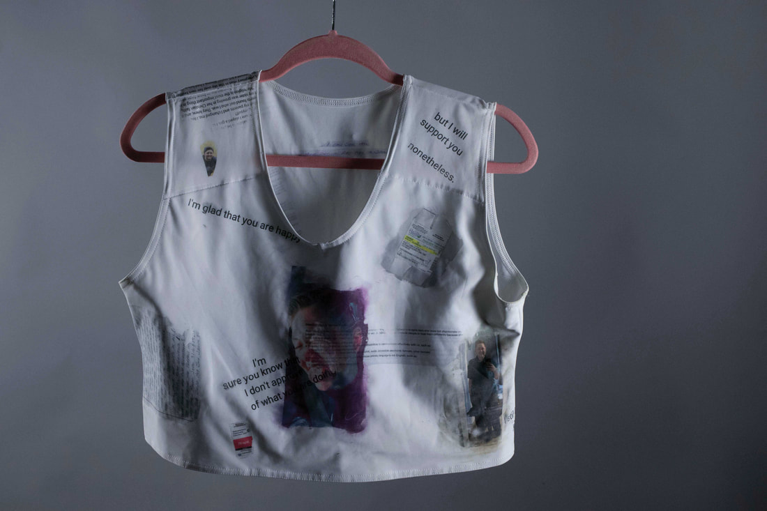
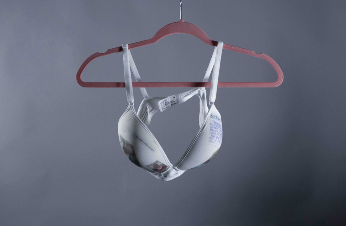
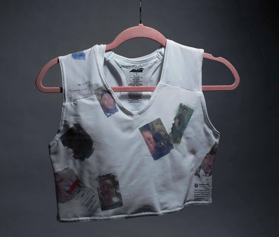
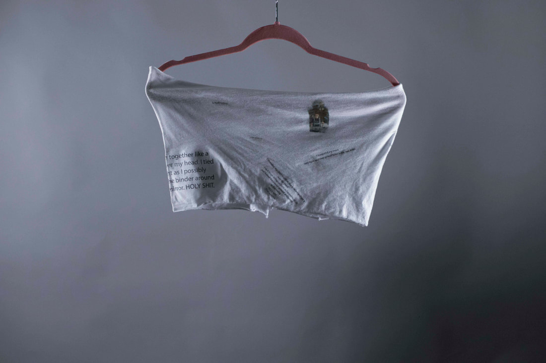
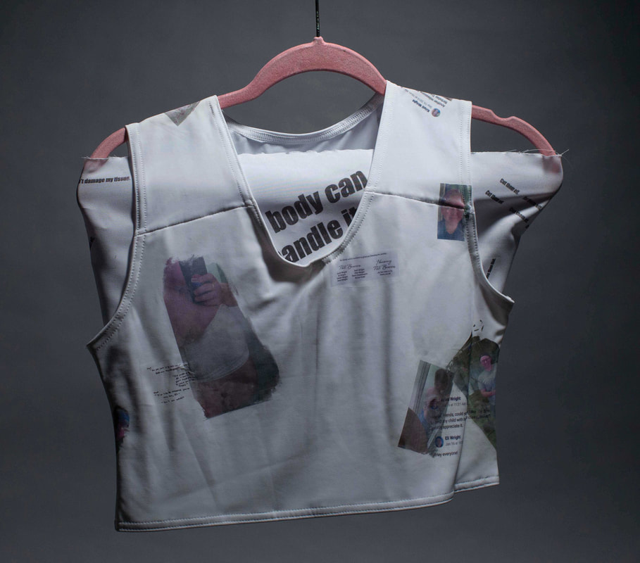
Unbound
This project was created by DASS printing on a range of five binding materials. The materials are all items I have used during my transition to bind my chest. The images and writing are from different times in my life throughout the process and from my autobiography. These pieces are to show the pains, experiences, and reactions transgender people go through during their lives. The "Unbound" project was also meant to be an exploration of my life to help me understand myself and seek answers to all of the questions I have.
This body of work is created in order to further explore my life through transitioning. It incorporates not only physical items that helped and restrained me, but also images and pieces of writing that had similar effects.
This project is made up of five different articles of clothing: a training bra, a 24B bra (the first bra size I can remember back to), my first (and handmade) binder, my first purchased binder, and my latest purchased binder (and the one I will wear till top surgery). Each piece of clothing is covered with DASS transferred images and writing that help demonstrate my journey through my transition and overall a huge part of who I am as a person.
Each piece of chest ware is used to represent a portion of my life—ranging from: childhood, teenage years, and the first three stages of my physical and mental transition. They demonstrate the choices I made—to hide, to alter myself, and even to jeopardize my health in order to save my mental health.
Along with these articles of clothing, are images correlating with that time period. Some are transferred in a clean and focused manner—this represents times in my life where I was “certain” or unquestioning of my identity. Others are blurred this is to demonstrate the times where I was unsure and questioning who I was and why I was born the way I am. Intertwined with the images are pieces of writing—some from others and some from myself. This are meant to be the underlying dialog that influenced me choices and emotions during these time periods.
There are three main types of writing incorporated in this project: sections from my autobiography (written at the request of my gender therapist), letters or text messages from people close to me that had drastic effects on me, and pieces of writing from my younger self—pre-transition. I used these pieces to show not only what I was thinking—since that is an important side to my transition, but also to show how those around me received the information—good or bad.
This project started out as every other “finding yourself” project had, but it soon became a lot more to me. In the end it isn’t just finding myself—but allowing myself to be found by others.
|
|
|
|
|
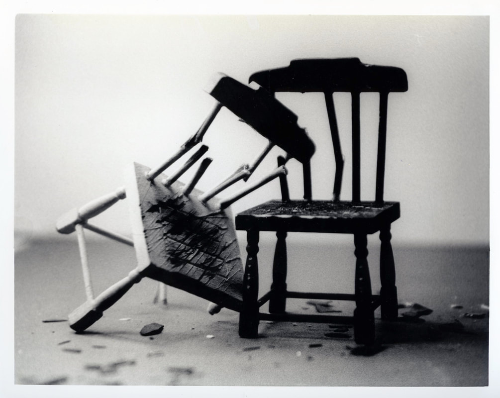
The Fall of Self
The Fall of Self series was created during my first photography course I took at Emporia State University using a black and white film camera and a darkroom. These images were printed as gelatin silver prints and processed in a darkroom using developer, stop, and fixture. The series was one of my first that really started to capture topics and emotions that were important to me and had effected a large part of my life.
Fall of Self is a photo series consisting of 14 images exploring the topic of depression, anxiety, and self-destruction. Through my middle school and high school years I had a hard time controlling and dealing with these emotions which led to multiple bad coping methods that would later give me insight on how I can help others overcome these feelings. The chairs symbolize people and how they carry the burdens they feel even when others can't see those burdens. The ropes and scratch marks symbolize the restrictions and experiences people have that lead to traumatic responses and self- destruction. This project not only helped me cope and work through years of emotions and issues that effected my relationship with my friends, partners, family, and with myself, but it also helped give me a way to bring this conversation to others who also struggle. My hope for this series is that it will bring others comfort in solidarity, and insight to the issues many people in our society deal with every day.
Fall of Self is a photo series consisting of 14 images exploring the topic of depression, anxiety, and self-destruction. Through my middle school and high school years I had a hard time controlling and dealing with these emotions which led to multiple bad coping methods that would later give me insight on how I can help others overcome these feelings. The chairs symbolize people and how they carry the burdens they feel even when others can't see those burdens. The ropes and scratch marks symbolize the restrictions and experiences people have that lead to traumatic responses and self- destruction. This project not only helped me cope and work through years of emotions and issues that effected my relationship with my friends, partners, family, and with myself, but it also helped give me a way to bring this conversation to others who also struggle. My hope for this series is that it will bring others comfort in solidarity, and insight to the issues many people in our society deal with every day.
The Fall Of Self I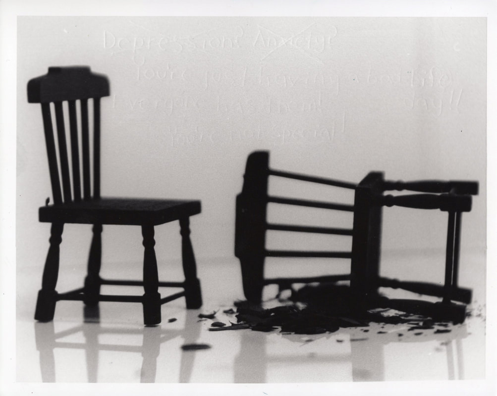
|
The Fall Of Self II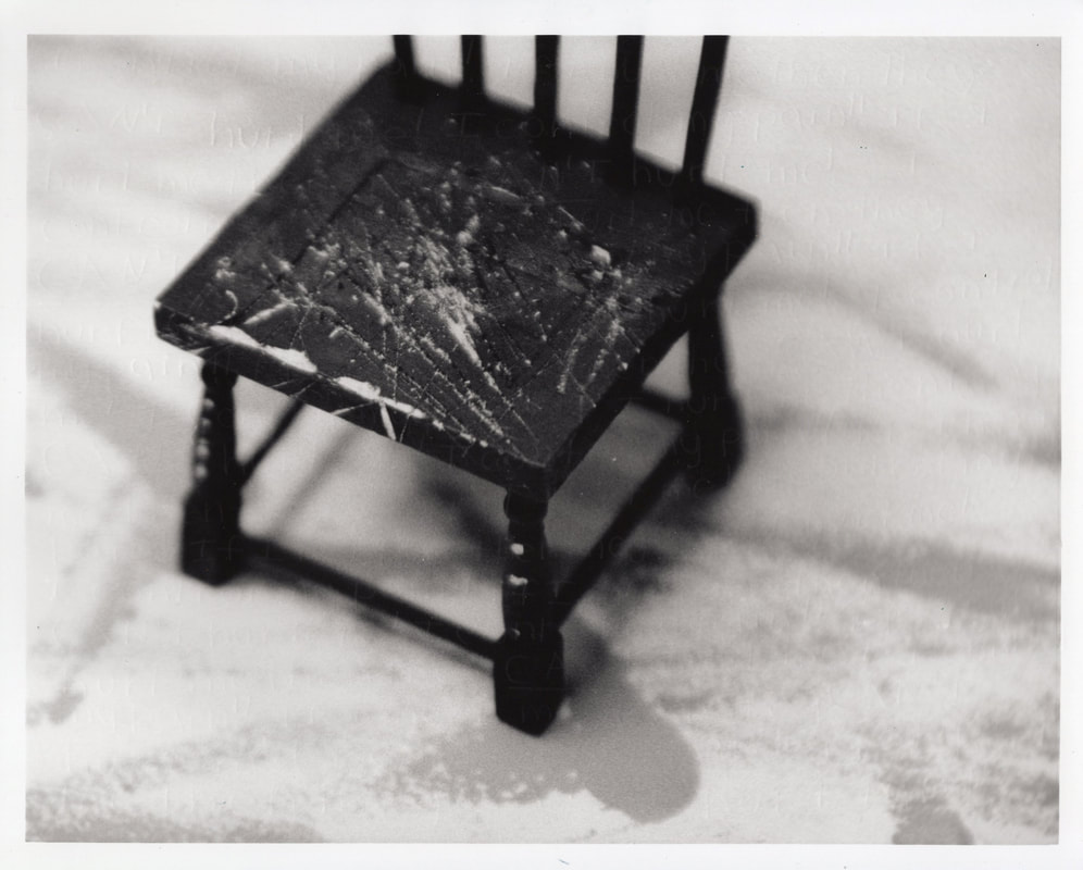
|
The Fall Of Self III
The Fall Of Self V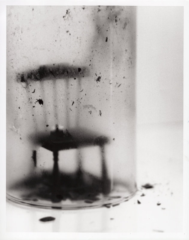
|
The Fall Of Self IV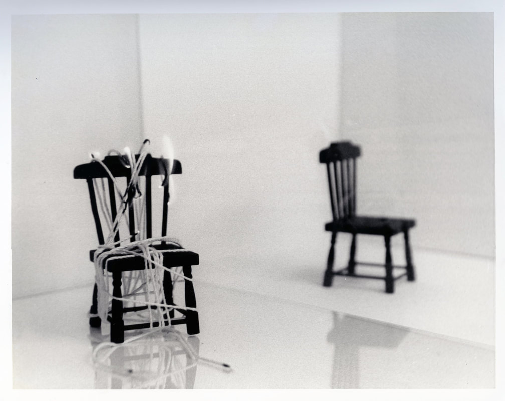
|
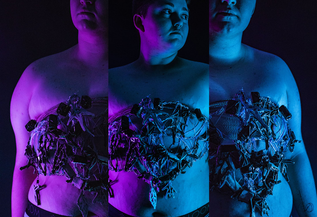
Tighter
Tighter was created to further my exploration of chest binding and how it effects my body. Through my previous projects I was able to begin a discussion about transgender identity, how my life has been affected, and how many transgender individuals chest bind. While chest binding was a topic that was covered in many of my works, I did not talk about how it affects me physically. Tighter was intended to create a discussion about how chest binding actually affects people and the cost it has on a person’s health and wellbeing.
This series was presented as ten 13”x19” images printed on Red River Satin paper. While there are many forms this series could have been presented in, I decided to stick with just printed images so the viewer could feel comfortable getting really close to look at the marks left on my skin. Although I think these images are very successful, I do think in the future I may try to present it in a few other forms to see if there are any better options.
This series was presented as ten 13”x19” images printed on Red River Satin paper. While there are many forms this series could have been presented in, I decided to stick with just printed images so the viewer could feel comfortable getting really close to look at the marks left on my skin. Although I think these images are very successful, I do think in the future I may try to present it in a few other forms to see if there are any better options.
Tighter I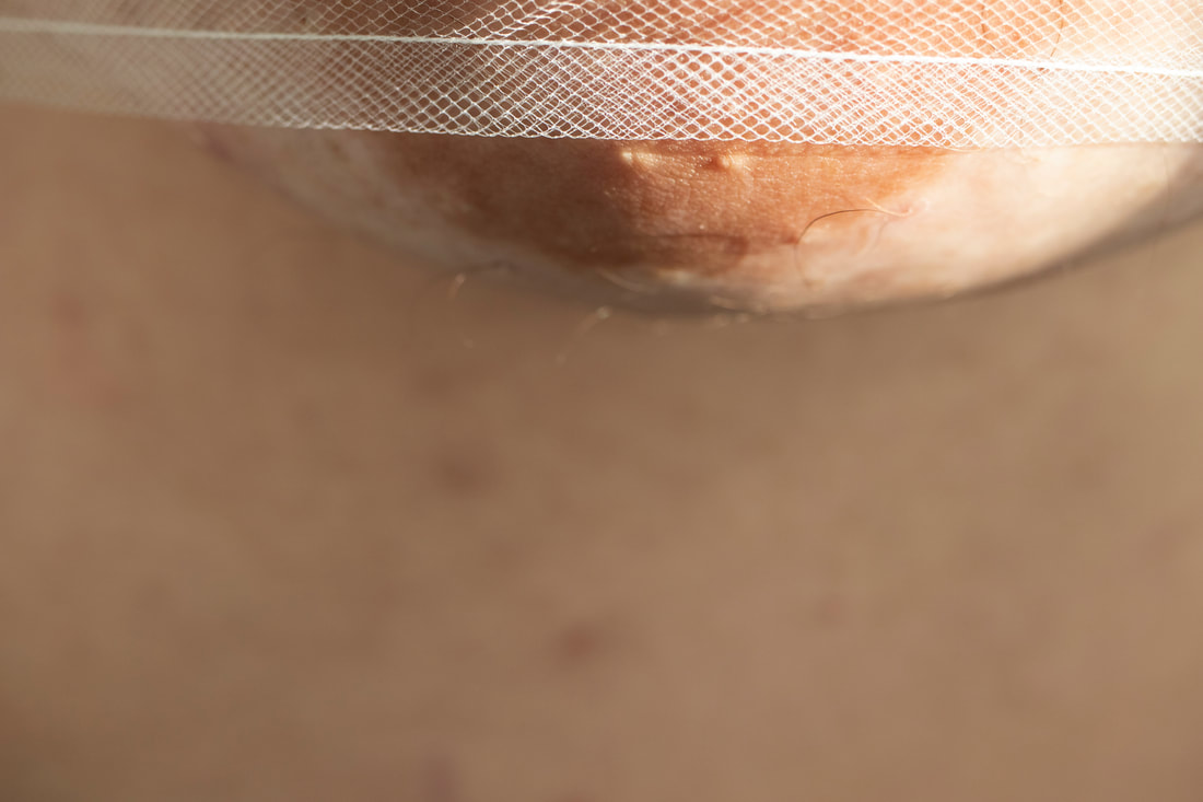
|
Tighter II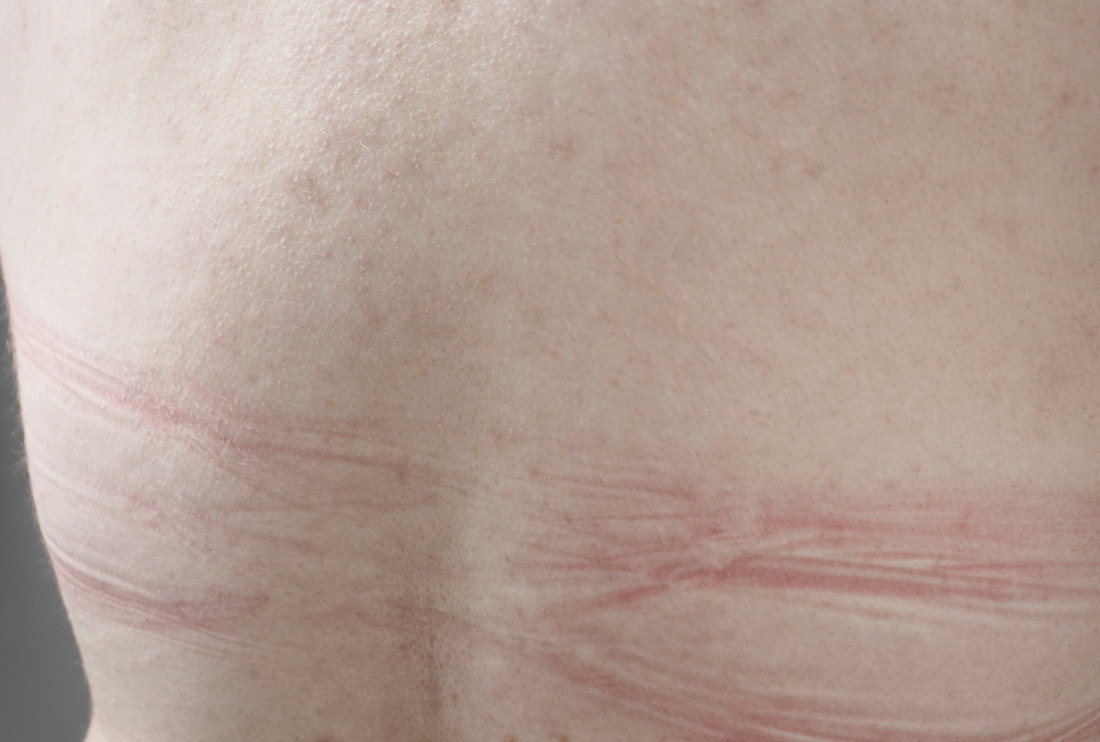
|
Tighter III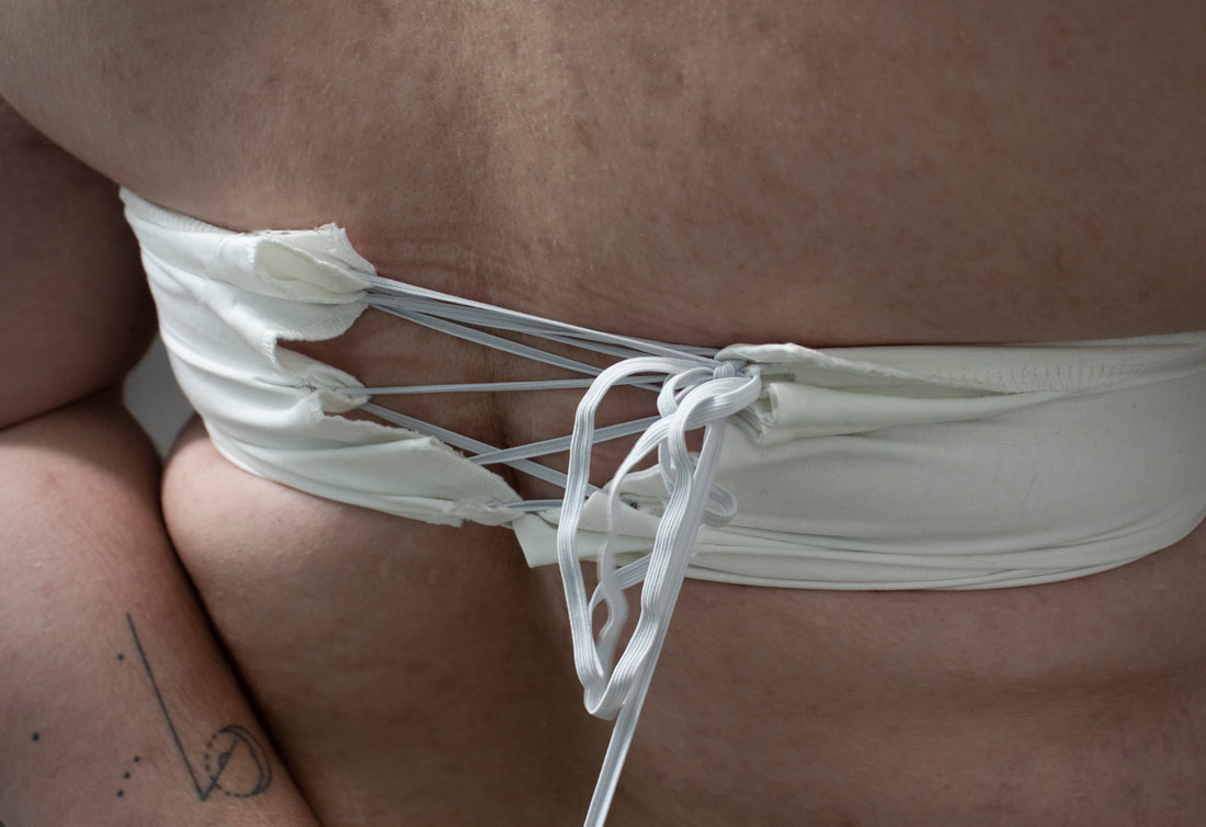
|
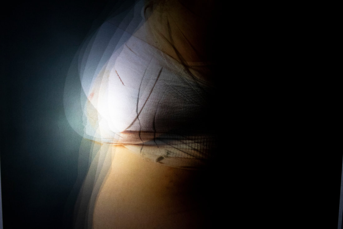
Passing
This project is over my experience with binding in order to pass as a cis male. It demonstrates the ways I have attempted to achieve this goal and its success/ unsuccessfulness.
Passing is presented in a shadow box format with translucent images. The images are compressed and displayed with a light behind allowing the viewer to clearly see every layer and detail. The images are ordered chronologically from my first binding material in the back to my current binder in the front.
This project was created to highlight a different topic within the overall concept of transgender identity. Due to the importance of this topic I have chosen to use it for my senior show. I have decided to explore this topic with a wide range of materials, each chosen to best express that specific section of the topic. For example, this project is done on clear paper which allows the images to be translucent. This aspect is extremely important to this project because it allows the viewer to see all of the different sections of my growth, but most importantly, to compare them to each other. Something I have struggled with is passing due to the fact that my breasts are so large. This means that even when binding it is hard to hide them well enough for people to assume, I am male. I am constantly reminded of this, basically every time I meet someone new.
This project also highlights my frustration with different binding methods. For example, the fact nothing actually makes my chest flat, or that some are tight enough to help more than my normal binder—but are incredibly dangerous. I struggle with binding in a way that helps keep my dysphoria at bay, but also is healthy for me. Especially since if you bind in a way that is too harmful for your body or bind too often you can destroy the breast tissue resulting in being denied top surgery.
Overall, this project will be a great addition to my other piece for my show, and it also allowed me to think through my daily life decisions. It helped me realize where I came from, and how others see me. This both helped a hurt—helped for the times I think my chest is bigger than it is and hurt for the times I feel it is smaller than it is. In the end it was a good experience for me as an individual and an artist.
|
|
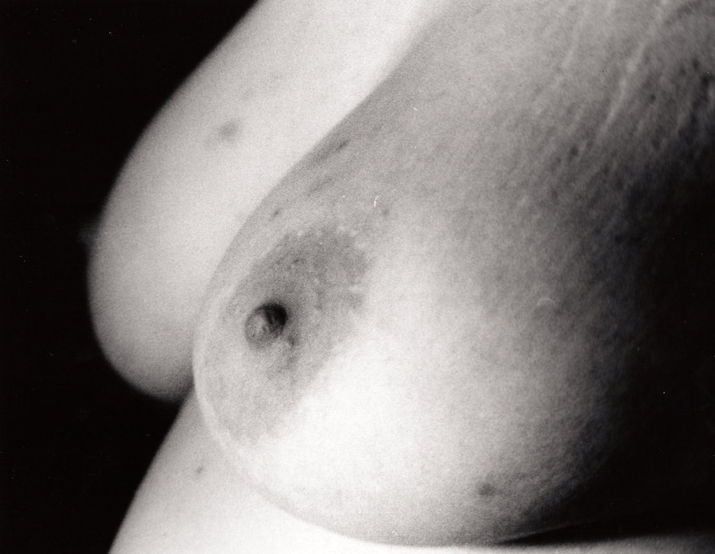
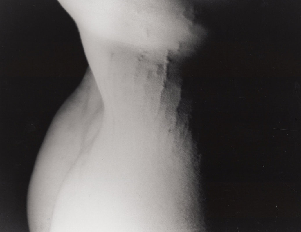
Body History
This was my final project for Photo 1. I used a film camera to take pictures of myself. This was extremely difficult due to the sensitivity of a film camera's light meter, and because I also had to contort my body in many ways to simply get the correct focus, lighting, and overall composition. Even having various backgrounds, it was incredibly difficult. My body was sore for weeks during this project from the different positions it had to be in for the shoots.
In the end this project was very successful, because it had very strong and clear images that demonstrated my overall message. This message was that my body -- through marks, scars, and its overall features-- showed my past and what I have been through during my lifetime.
I was very please with how successful this project was. It also allowed me to develop a better understanding of how my past has effected me.
Heavy Chest |
Stretch Marks |
|
|
The Price We Pay
The Worst Things In Life
This piece was created to explore the idea that we change the meaning of words and phrases by over using them. While my intention is not necessary to stop people from over using the phrase, I do hope that by doing this project people will think more about the words they are using and what they mean.
The idea came from the day my brother died. After he died, I realized that all the times I had said, “this is the worst day of my life”, meant nothing. That say was so traumatic and horrible that I doubt it will ever not be the worst day ever. Although I realize it could happen, I really hope it doesn’t.
I wanted to use this project to help draw attention to the experiences we all have, and to call attention to how we use phrases and what they really mean to some people. I want my audience to go home thinking about my piece. Thinking about the things people have gone through, and to think about their own lives. I realize it may make them upset or sad, but sometimes it’s good to really think about what we have been through, and how that shapes us.
This piece allowed me to have a mental break from my transgender projects and in a way take a step back to really look at what I have created. This project may not be about transgender identity or issues, but it is about my life and the lives of others. It explores humanity and the struggles we go through just to live life. It calls attention to topics that aren’t discussed frequently, which overall makes my art worth all of the effort.
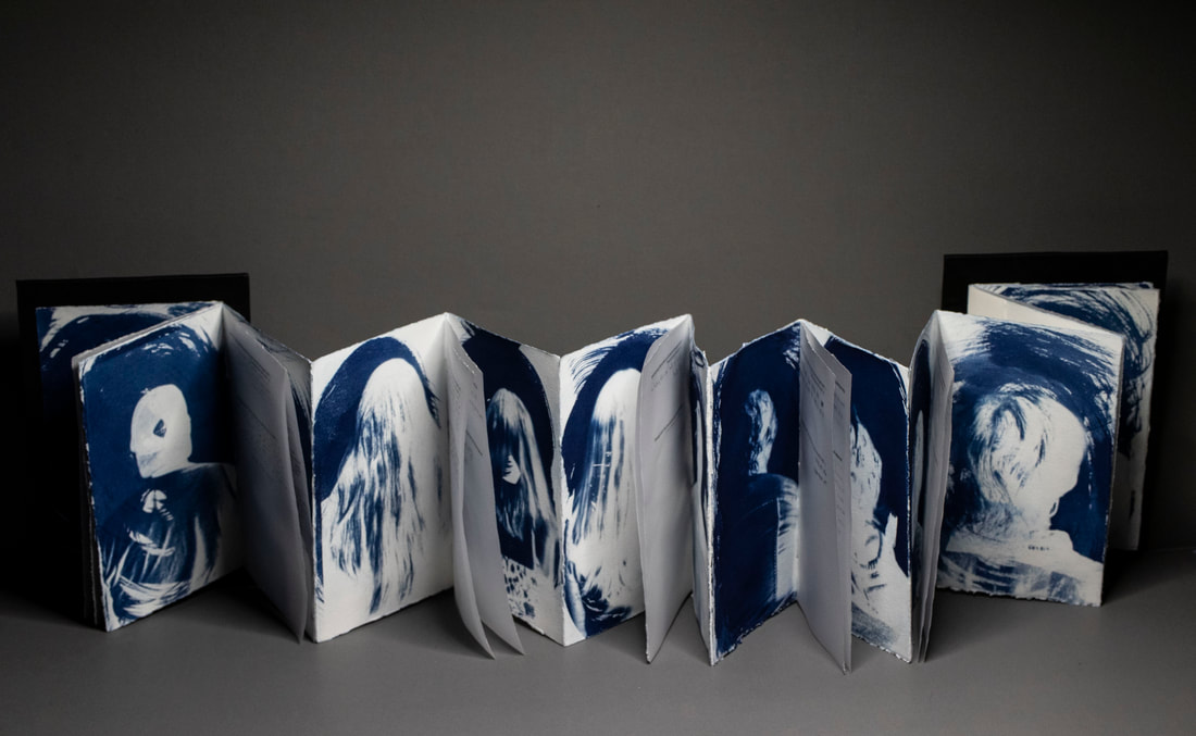
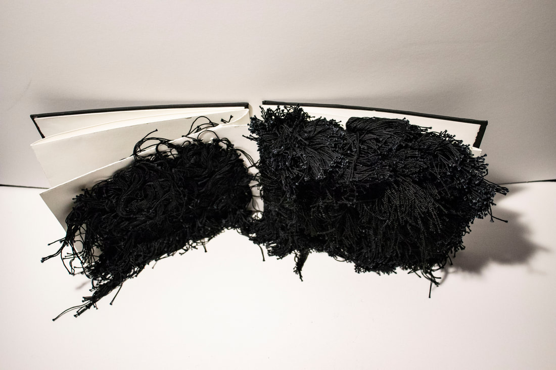
Different Perspectives
This book, "Different Perspectives", is a physical representation of my life. Each page illustrates a different unit of time measurement: decades, years, months, weeks, and days. Each page is covered with black threads, which represent one of that particular unit. The over all effect, is that even when looking at the same item, topic, or event-- changing how you are viewing it can drastically alter your response to it.
|
|
The Watchdog
The Watchdog was created to help me cope with putting my childhood dog down. This book let me experience losing her in a therapeutic way that made it easier to deal with. I wanted to create a book so I could memorialize her for my family and myself.
Like my dad’s book, this book was really hard to work on some days and eaiser on others. The content was done with debossing so the viewer must devote their whole attention to really be able to understand it. I wanted to make these books a bigger experience for the viewer than just books with words printed on it. The debossing means the viewer is able to feel the words and images on the paper, giving them a deeper and more impactful experience with it.
I used pink wallpaper from my grandparent’s house, handmade paper using flowers from my dad’s funeral. I know he would be thrilled to know his flowers were used for a book about Vika. I also used a crème, no tooth paper so the debossing has no competition. This really draws attention to the debossing and makes it pop.
I was really inspired by my dad’s book and the idea of trying to make works something someone is supposed to touch and really experience. This has pushed me to make really in-depth books with lots of little details to be taken in. The more time spent with this book, the more the viewer is rewarded.
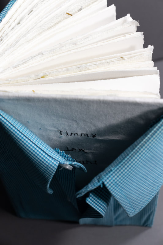
Timmy Lew Wright
This book is titled Timmy Lew Wright in honor of my father who has passed. This book was created using Stonehenge cream paper, handmade paper (using flowers from my dad's funeral), one of his dress shirts, DASS transfers, and a Cricut was used to deboss pieces of letters that people wrote for me.
I created this book in order to save a piece of my father for years in the future. I wanted to save his stories and life for others to remember and for me to keep him close to my soul. I didn't get a lot of time to be friends with my father, because we had some strong differences when I was growing up. Becoming friends with my dad the year before he passed was one of the best and hardest things I've had to do in my life. I knew going into the friendship that it was the last chance and that if I didn't take it now I would lose it and any chance I had of getting to really know my father. I decided to start recording every time I went to visit him in the nursing home after he was moved in. Listening to those recordings I realized I still didn't know much about my father. Reading the letters everyone wrote me helped me make up for the time and memories I had lost.
I had a lot of issues with this book in many ways, like all art pieces it has its own problems, but I have learned so much while making this book. It has definitely been one of the most memorable pieces I have ever worked on. At times I had to take a break because I would realize that part of me expected my dad to walk in my front door looking brand new, so reading the letters and seeing the pictures and realizing he was gone was a lot to handle.
I'm glad I decided to create this book, and will cherish the lessons I learned and the memories I have saved in my heart forever.
HUGE thank you to everyone who wrote me a letter, and to my mother for helping me stitch the cover cloth at 12am on a Sunday.
|
|
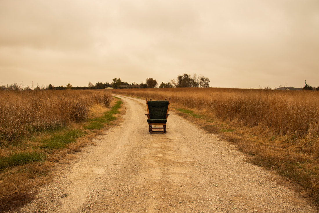
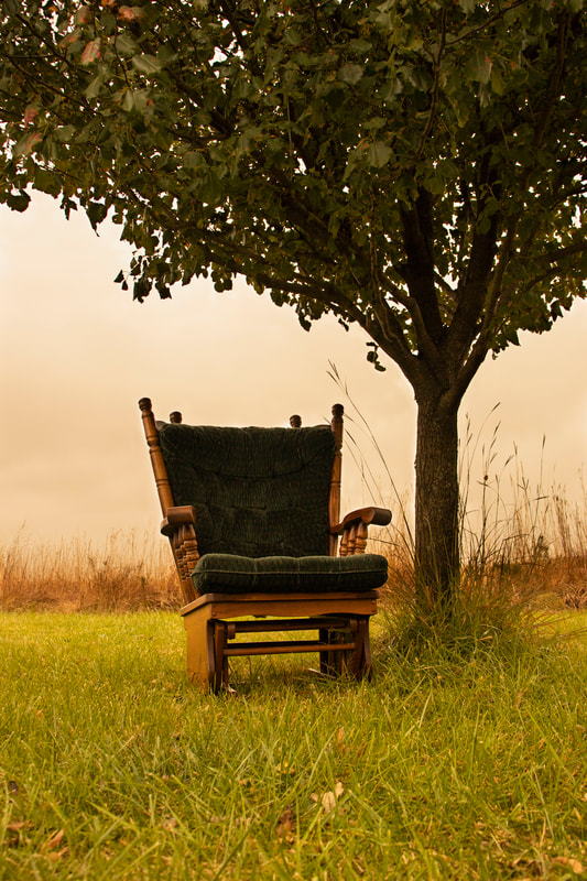
Remnants of Home
Remnants of Home is a public art series created with the intent to have it shown in the window of a downtown business. This series was created over my dad’s experience with leaving home and moving to his nursing home.
This series includes ten images, four of those will be printed on a vinyl banner and displayed in a window. All of the images have a warm filter on them to help give the impression of a warm and emotional memory. Remnants of Home features my father’s glider that he has had for my entire life, and the chair that he sat in the most while he was home. I used this glider to symbolize my father being in those spaces and to give the impression that he can only be there through memories since he is unable to leave the nursing home.
The locations used for this project are places around our house or places he spent most of his time at. I felt it was important to include his favorite locations in order to help him return to them through this series. This series as well as my I am Tim series have helped me learn more about who my father is and to form a closer relationship to him. It is important to me to capture my father’s life and his experiences now, so that I will have them when I don’t have him anymore. While the intent of this project was to bring closure to my father and to help me spend more time learning about who he is, it also helped me get closer to my mother. To My mother spent a lot of time with me taking pictures for this series and she has continued to help me with current and future projects. My hope is that through these images my family will finally start to understand each other and create the relationships we should have made a long time ago.
A Walk Down The Lane |
Beneath The Peach Tree |
|
|
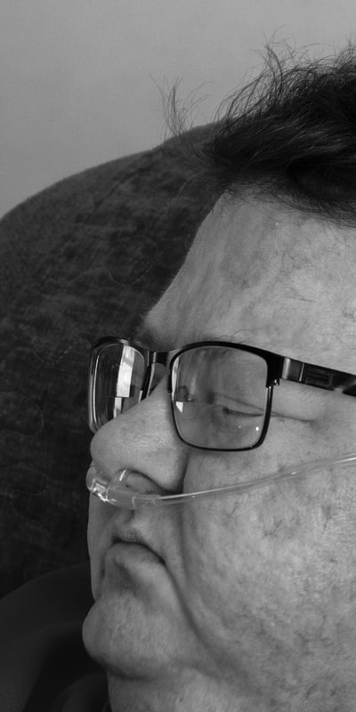
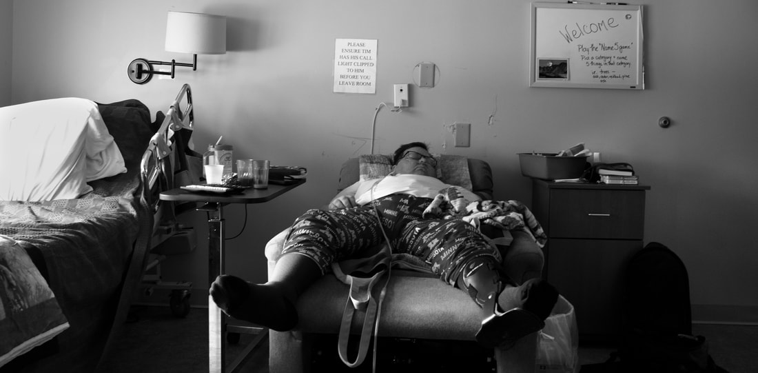
I Am Tim
I Am Tim is a large-scale project over my dad’s experience with cancer and how it has changed him. This series was created to help me really introduce myself to my dad and vice versa, and also to be able to spend some time together while we have it.
The series was created on Red River Ultra Pro Satin paper with an inkjet printer. I Am Tim was done in black and white to add to the somber feeling of the series and draw attention to what is happening in the images rather than the colors and small details. I wanted this project to really capture my father’s emotions and the experiences he is having day to day with or without someone else. He spends a lot of time alone with his thoughts and his brain plays tricks on him. This causes him to be very confused and scared most of the day. He has also been experiencing a lot of nightmares and panic attacks that lead to him calling me and my mother in the middle of the night begging us to help him. This terrible experience is something he is having a hard time coping with and so am I. I always want to help him more than I can, and I feel like I am stuck in a place where all I can do is watch.
These ideas and experiences are shown through the black and white color palette, as well as, the embossed words that are quotes from my father. This series is meant to be raw and emotional and to cause discomfort in the viewer. When the viewer gets close enough to really see the work and the embossed words on it, then they will be close enough to imagine the pain and discomfort my father feels. Only then will they be able to really start to understand his experience.
I Am Tim: I
I Am Tim: II